
This content contains affiliate links. When you buy through these links, we may earn an affiliate commission.
Book covers are the first tool in marketing and publicizing any title. What the cover conveys can either make a reader want to learn more or turn them off immediately. We can say we don’t judge a book by its cover all we want, but we do. It’s natural. It’s how we can even sort through the millions of packets of information we encounter every single day.
YA book cover changes used to be really common. You’d see a design for the hardcover edition of a book and before that book had been out for even a few months, there were images of a new paperback edition already floating around. Some publishers and imprints were doing it at lightning speed.
Things have slowed down quite a bit. There are numerous reasons for that, of course, including the fact there’s just less YA than in the past (there’s still a lot). I do not have data here, but it also seems to be that more money is being spent to repackage older titles and series to appeal to new readers than is being spent to repackage frontlist titles. This isn’t bad—it’s great that some older books and series that didn’t quite see the readership they deserved are getting new looks to encourage that readership.
But there are still YA books that look one way in hardcover, and then, a year or two or more later, they see a whole shiny new look in their paperback iteration. Let’s take a look at four cover design changes that you’ll see in 2025.
I’ve tried my best to credit creators where possible. Still, this many years of begging for an easy way to find out who designed and created book covers has not made it easier. Not including credit is not for lack of trying—no matter how nicely credit may be given on a social media site during a cover reveal, discovery of that information is challenging due to the ephemeral nature of social media. Including design credit on landing pages for books on a publisher website is an easy, stable way to do just this. Not everyone has access to a print copy to search copyright pages or back covers, and “look inside” features often do not include this information.
Lark & Kasim Start a Revolution by Kacen Callender
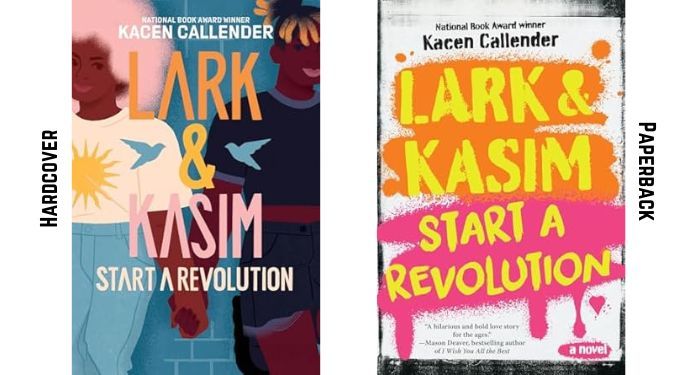
This is the most drastic cover change of the four in this roundup, as the paperback iteration takes a totally different turn than the original hardcover. Despite the big change, the two covers are definitely cousins. You can see the inspiration for the paperback from the hardcover.
On the hardcover, we see human connection as the focal point. Both the characters presented—presumably Lark and Kasim—are teens who do not care about fitting in. They have their own unique styles, and their hands being held hints at something more than friendship. The brick wall behind them suggests that perhaps they won’t be letting something like that stand in their way or hold them back.
The paperback looks like the “after” image from the hardcover. We see the revolution in progress. The spray-painted background with a title font mimicking handwriting is clever and keeps the bright look of the original cover.
Both are good. I don’t know if one is better than the other, but it is a bummer to see a cover with two Black characters lose those images in favor of a font-driven look. If I am being completely honest, I think maybe the UK take on the cover is the star among them all.
The paperback edition of the book is available now.
Level up your reading life while you support an independent media resource! Become an All Access member and explore our full library of exclusive bonus content and community features. Sign up now for only $6/month!
The Shadow Sister by Lily Meade
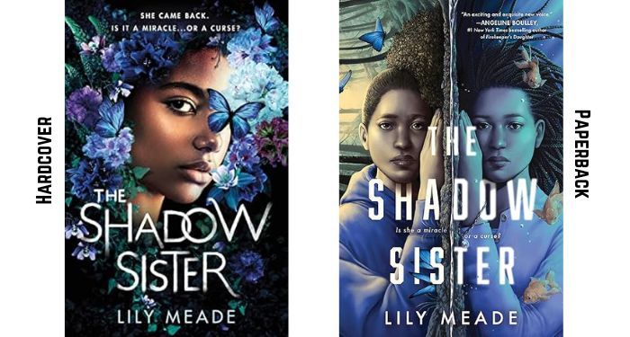
Where we lost two Black characters in the redesign of Callender’s cover, we gained a bonus character of color in the paperback redesign of Meade’s debut. In many ways, while the original hardcover edition is eye-catching, it’s also fairly cliche in terms of being a YA speculative fiction design. We see a face surrounded by flowers, as well as a butterfly. This doesn’t tell much about the story at all, even if it is nice to look at.
The new design for paperback tells a little bit more. It does so without getting tossing the original cover, too. We still have the blue butterfly, but now we’re adding a nice blurb from a prominent YA author. There’s also a slightly different tagline. Rather than note she came back, the paperback simply asks the question whether she—not “it,” referring to the return, as in the first cover—is a miracle or a curse.
The paperback cover has a lot more energy to it. It still conveys that there’s something secretive or shadowy going on, but we have some suspicion about what that might be.
Art on the hardcover came from Shaylin Wallace, and the design is by Liz Dresner. Meade made a video about the cover in October 2022, noting that the image on the cover isn’t meant to be the protagonist. It’s the protagonist’s sister, who is the person who returned.
The paperback edition of the book is available now.
Twelfth Knight by Alexene Farol Follmuth
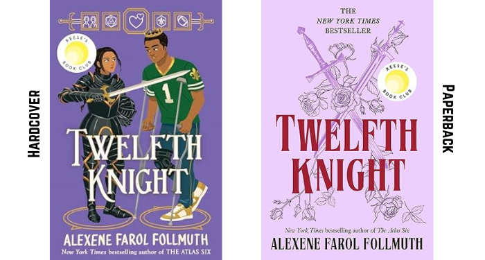
The cover redesign for Twelfth Knight is second in terms of major overhauls, but the color scheme and use of some of the iconography from the hardcover show up on the paperback, too. But again: we lost two characters of color on our hardcover design in favor of no faces on the paperback.
What’s interesting is this redesign is angling for a different market. Where the hardcover looks very teen and includes a lot of the key pieces of the story on it, the paperback strips that all away in favor of simple swords and roses. The paperback looks like a book designed to be marketed to the adult market. That might not be surprising, given that this book was the title that re-invigorated Reese’s YA Book Club last summer. Perhaps adults were not interested in a book that looked as teen-like as it does? Maybe, too, the repackage aims to reach readers who are fans of the author under her other name, Olivie Blake.
Of note: “New York Times Bestseller” is on the new paperback front cover not once, but twice.
It might be an unpopular opinion, but the hardcover speaks more to me, as well as more to the story, as well as more to the teen audience for which it was written. The paperback is fine and it’s inoffensive; it just kind of looks like a lot of other book covers out there.
The hardcover and paperback editions of the book were designed by Lesley Worrell. The art on the hardcover was created by Jacqueline Li.
You can grab the paperback edition on May 13.
Warrior Girl Unearthed by Angeline Boulley
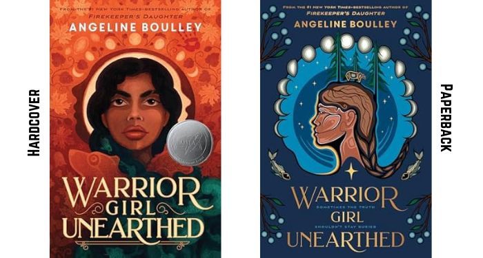
Last but not least is the redesign for Angeline Boulley’s sophomore novel, Warrior Girl Unearthed. The original hardcover uses earthy orange tones, with a Native character looking directly at the readers. That gaze is strong and memorable, but there’s softness coming from the profile in yellow behind her. There is a pair of animals beneath her. One is a bear and the other is a little difficult to decipher, especially under the award seal, but appears to be some kind of water creature. It is a good, strong cover.
The paperback is equally strong, though. Several notable differences still pay homage to the original, including the phases of the moon radiating around the head of the central character’s image. But rather than the main character looking outward at the reader, the paperback features a profile. There is a lot of strength conveyed in that profile, even without the eyes forcing the reader to pay attention. The cheeks and jawline are strong.
One of the more subtle changes of the paperback edition is the color and weight of the title font. It’s lighter in both, and against the deep blue background, it looks like it is shiny.
Both covers are great. Both will sell the book to the intended audience. But forced to make a choice, I think the paperback one stands out just a tiny bit more.
The hardcover was designed by Rich Deas with art by Michaela Goade, a creator of Tlingit & Haida tribal enrollment. Ojibwe creator Emily Kewageshig did the art for the paperback edition.
The paperback edition will be available on May 6.